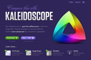
I saw a very telling article this morning on Ajaxian about a new Mac app called Kaleidoscope:
The Website for this tool is so well done, that I feel compelled to click buy even before downloading the free 30 day demo 🙂
That is what you’re going for- albeit perhaps without the buy part. Your users should be enchanted. Eager not to just try it, but to turn their life upside down just to be able to use it!
The site is really just one page with some anchors down to content farther down. Honestly the design of the page with the big horizontal sections isn’t pulled off that well, but overall it’s very sleek.
The app interface looks simple but does some pretty amazing things. I work with images all the time, have never needed something like what it offers for image comparison, but it’s such a cool feature that I want it!
But think about this- this app has one page on their site and conveys a solid perception of trust and dependability by the finished look of their site.
In the Chrome browser, I didn’t realize for a while that the image of their rainbow-y icon actually had the color gradually shifting. Wow. They must have so much time to be able to do something that’s such a waste of time, right? No- they’re serious about this being a great app and have spared no energy to convince others of that fact.
